So this sprint is pretty strange because we have Spring Break right in the middle. While some of my team members are choosing to work over the break, most of us are trying to make the most of this time we have off. Therefore, I tried to get a majority of my sprint work done before I leave for the week. In this blog post, I’m going to highlight some of the UI concepts I put together to help make players more aware of what team they’re on.
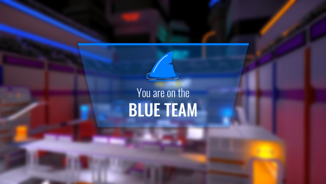
On the Context development team, we briefly talked about the possibility of giving the teams names, instead of just colors. We brought this idea up to the rest of the group and a majority felt that team names felt a little silly; however, creating team logos wouldn’t be a bad idea. I jumped on this idea immediately and created a concept logo for both teams. The orange team’s logo is meant to look like a tiger’s paw, while the blue team’s logo represents a shark’s fin.
I sent these concepts to our artists and they agreed that the direction I’ve gone in makes sense, but these logos need to be more aggressive. When Mike gets back from GDC, he’s going to try to create more appropriate logos for both teams. For now, my concepts will have to do.
After creating the logo concepts, I had to come up with a very clear way to show players what team they’ve been put on. I looked into how other games communicate team assignments to the player and there certainly are a lot of different options. My personal favorite was how Halo 4 handles their team assignment screen. They make it very clear by showing the player a pop-up message with their team color right before the match starts. I felt that this approach was appropriate for our game because it echoes our televised game show context.
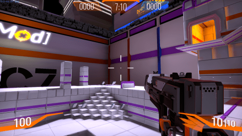
While I’ve been putting together these UI mock-ups, James has been implementing our new score system. Therefore, we needed a new HUD element that communicates the total point value of both teams. Below, I’ve included the current mock-up of the team point HUD.
The last piece of team-related UI that we needed to figure out was our win/lose screen. We have a new scoreboard, which was implemented last sprint; however, we needed a specific win/lose screen so that the team as a whole would know if they won or not. I wanted to set up this screen so that it emphasizes which team won, but also shows the point comparison so that the losing team knows how close (or not close) they were.

Anyway, that’s all for this week. I’m headed off to Florida so you won’t get an update from me next week. Until next time!
